Age of Anxiety Editorial Series
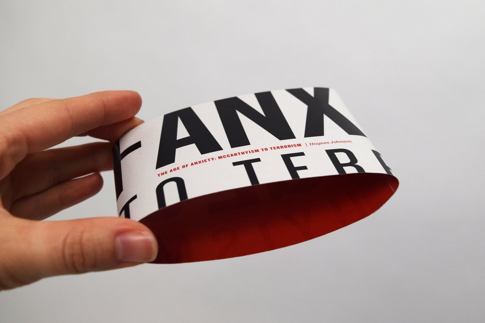
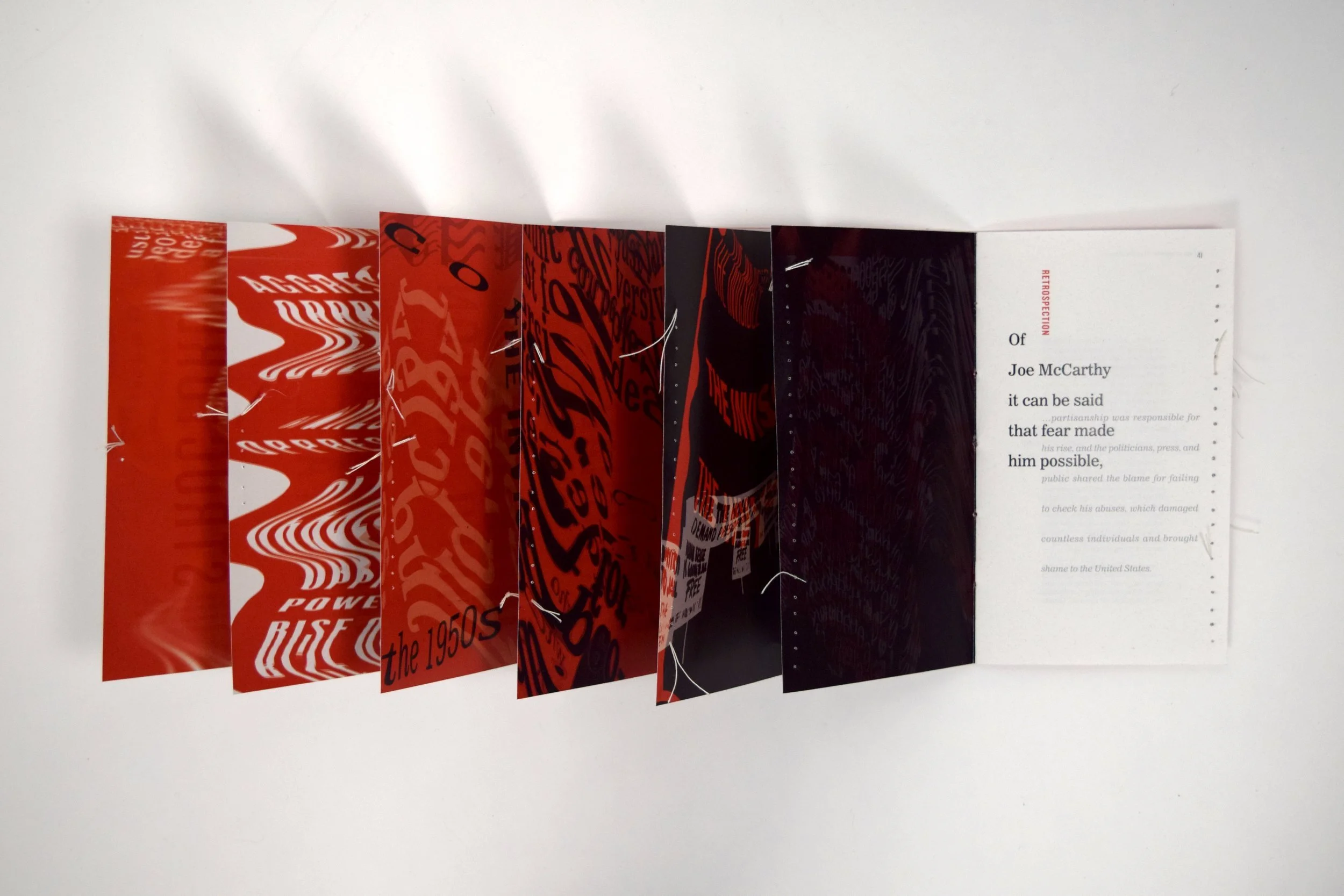
The Age of Anxiety: McCarthyism to Terrorism is a research-driven typographic experiment exploring the McCarthyism period in the United States. The resulting six-part interactive signatures use expressive typography, interactive elements, and visual design to help the user engage with and understand the McCarthyism period, as well as the impact this trend has had upon the American political system today.
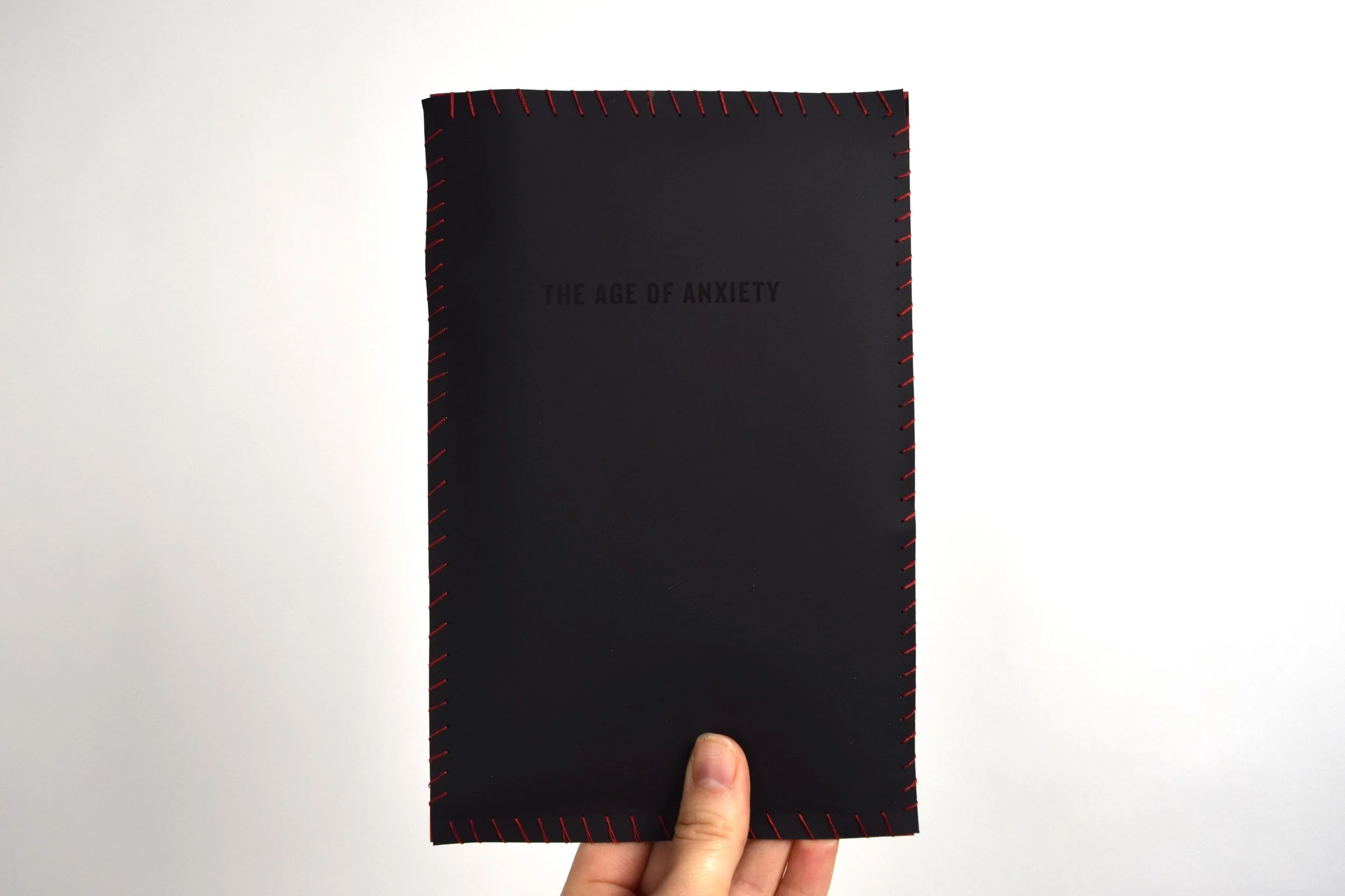
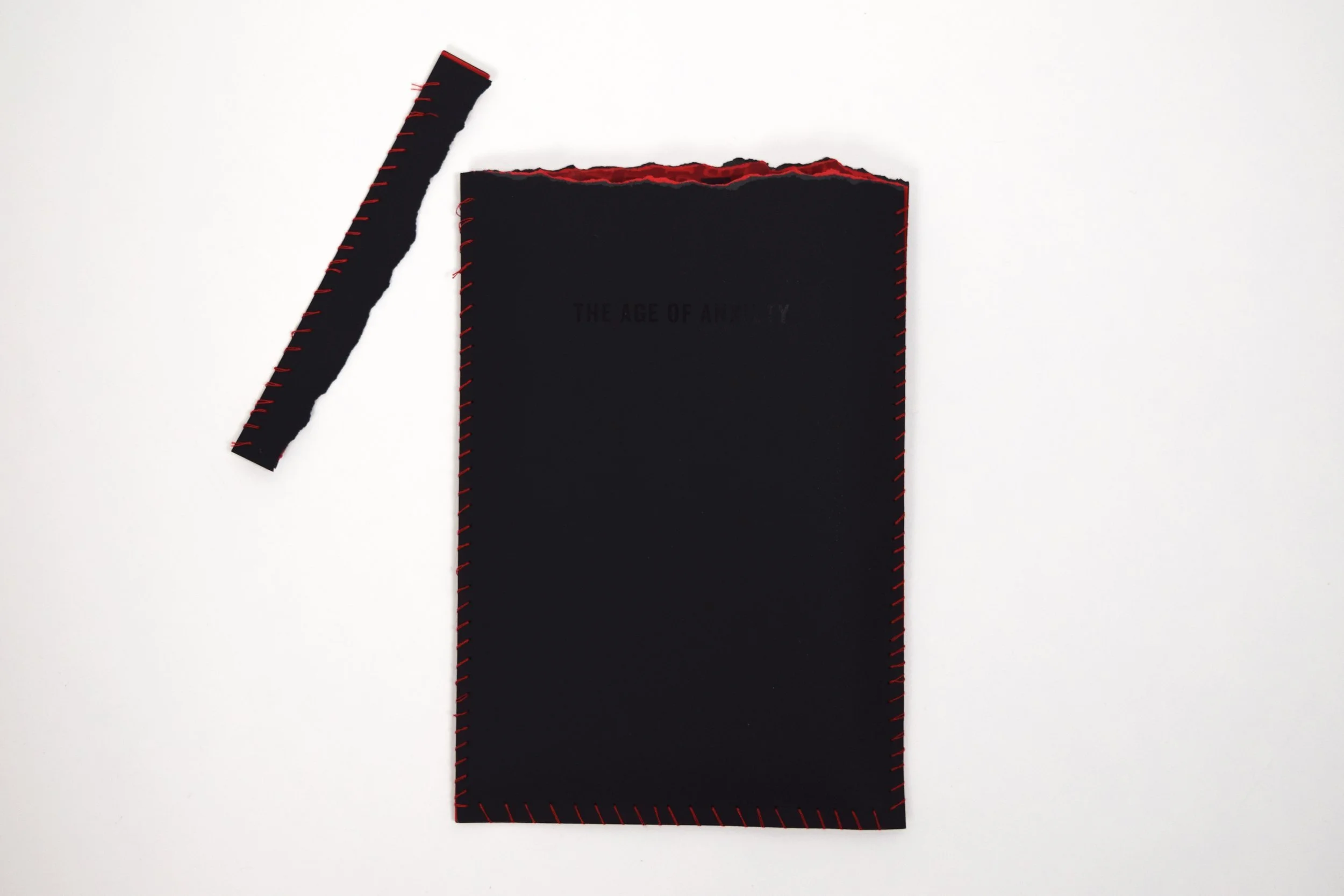
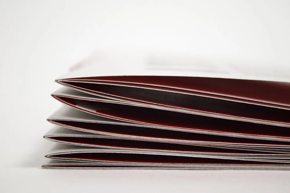
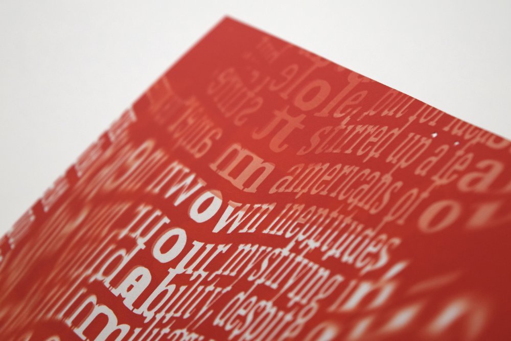
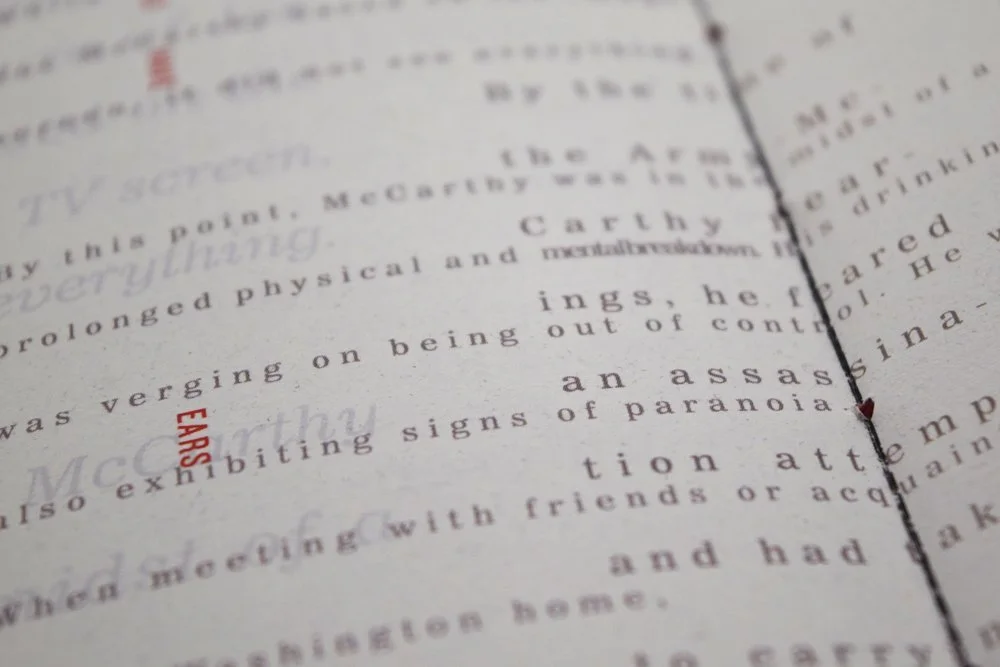
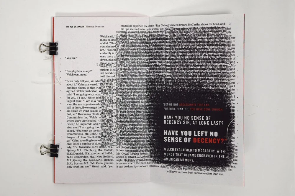
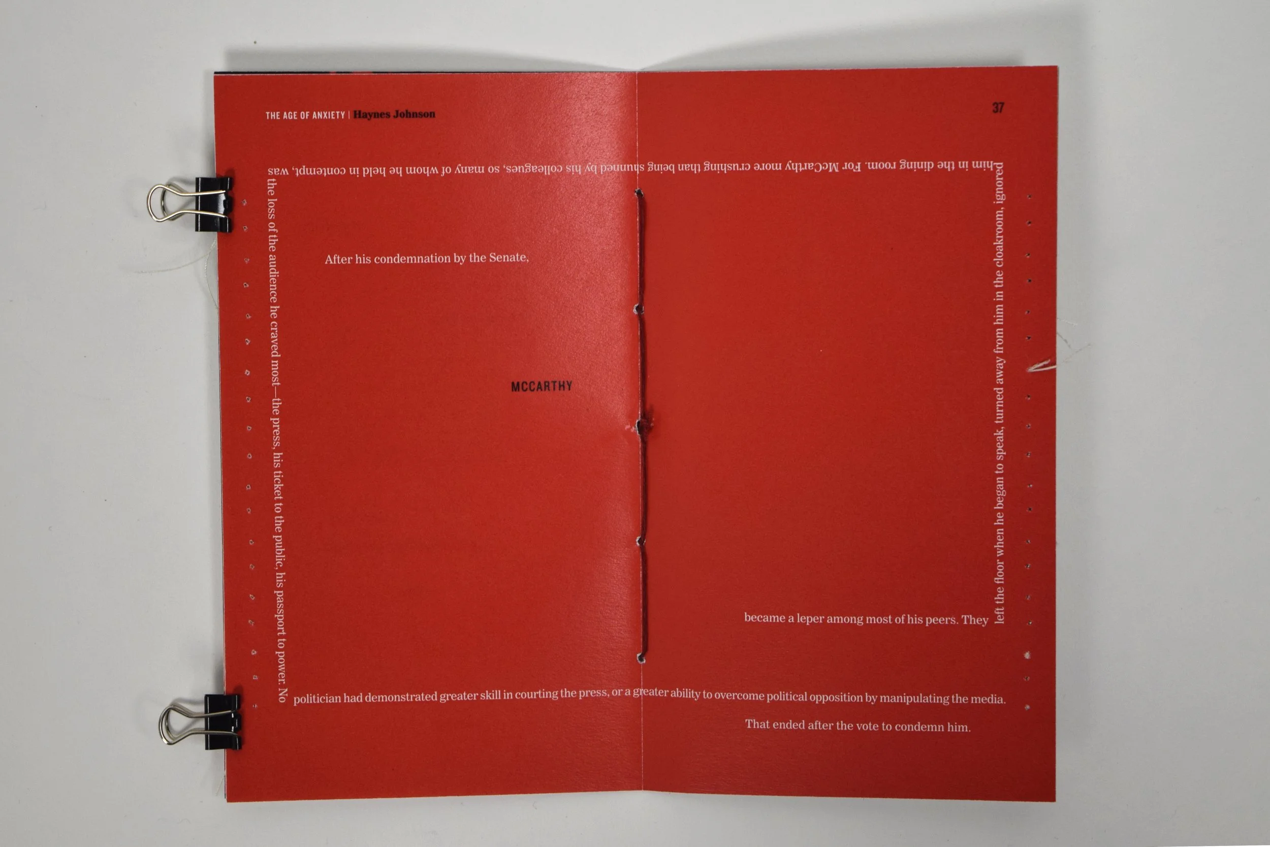
Designed with intentional barriers to communication, like low contrast coloring, sealed and sewn portions, and illegible typography, the user’s experience makes a parallel to the role of information gatekeepers in American politics. In order to access the truth of McCarthyism through all six designed signatures, the user must learn to balance power and restraint — a nod to the core message of Johnson’s writings.
In 2017, Age of Anxiety was awarded a passing grade in the International Society of Typographic Designers student assessment. More information on ISTD and press coverage on Age of Anxiety.
Company
Personal Work
Role
Research & Strategy
Concept Development
Design
Binding & Physical Assembly
Credits
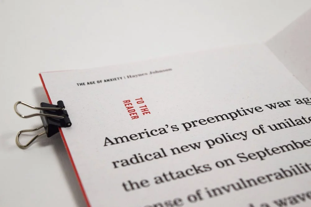
All copy derived from: The Age of Anxiety: McCarthyism to Terrorism by Haynes Johnson
STRATEGY & SPECIFICATIONS
Entry to the competition required highly detailed research, documented typographic strategy, in addition to designed articles themselves. Excerpts from the submission are outlined below.
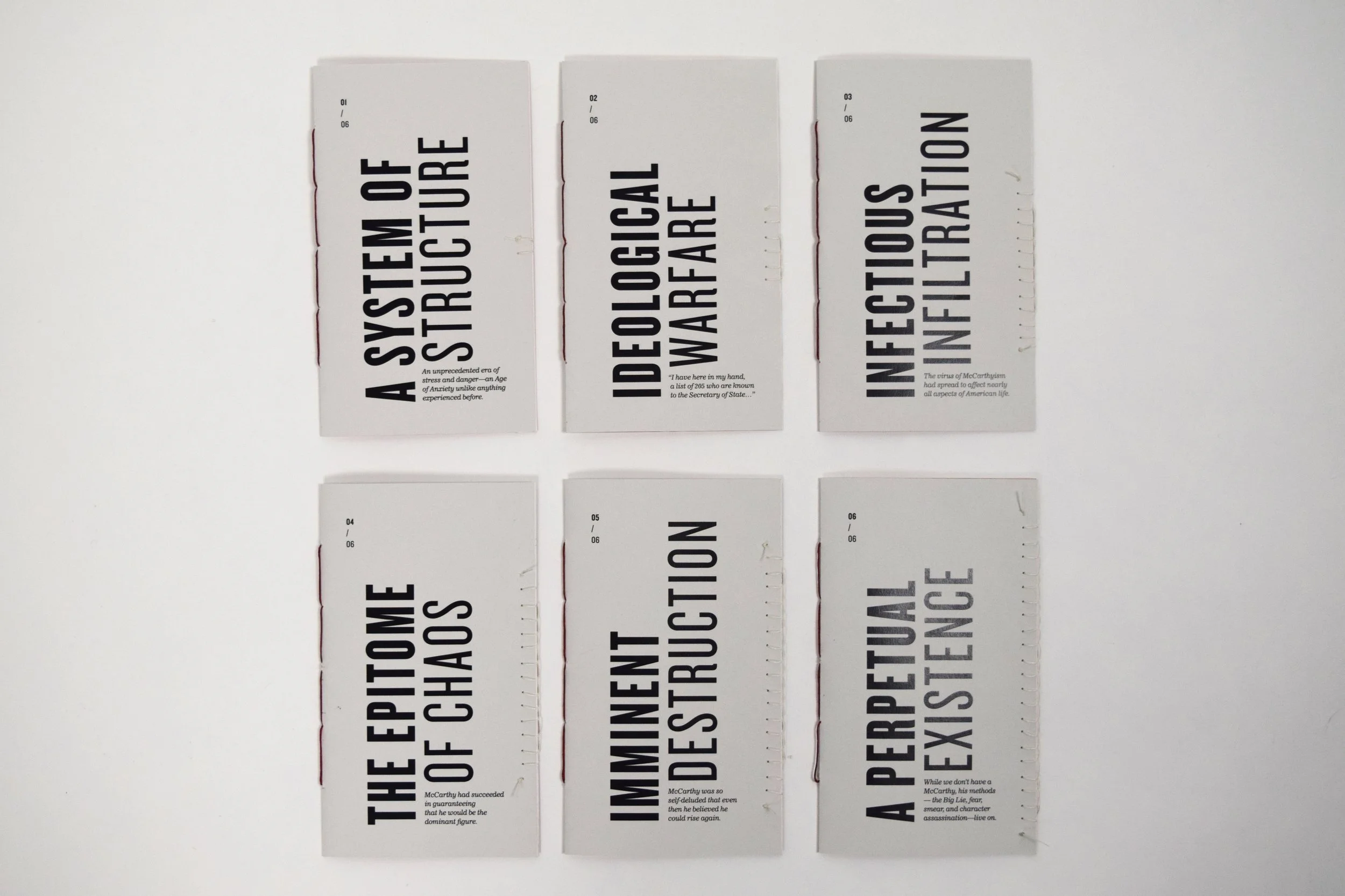
DESIGNED FORMS
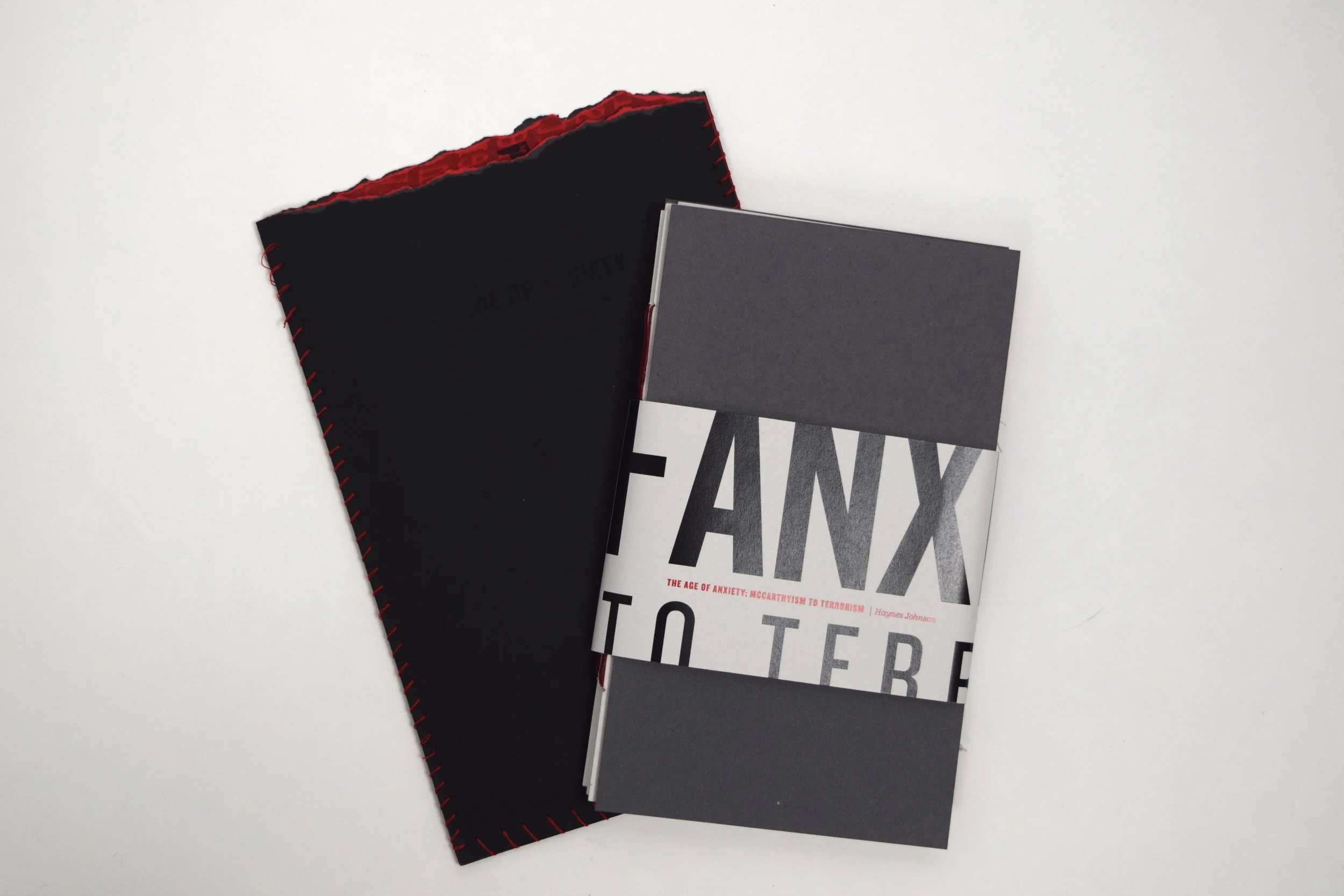
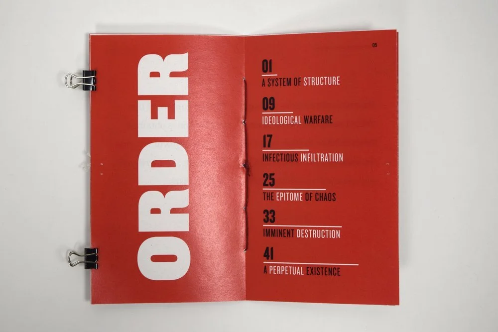
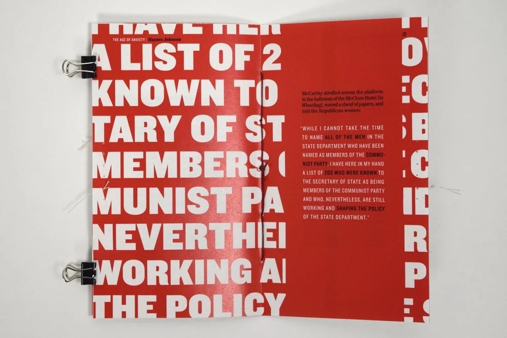
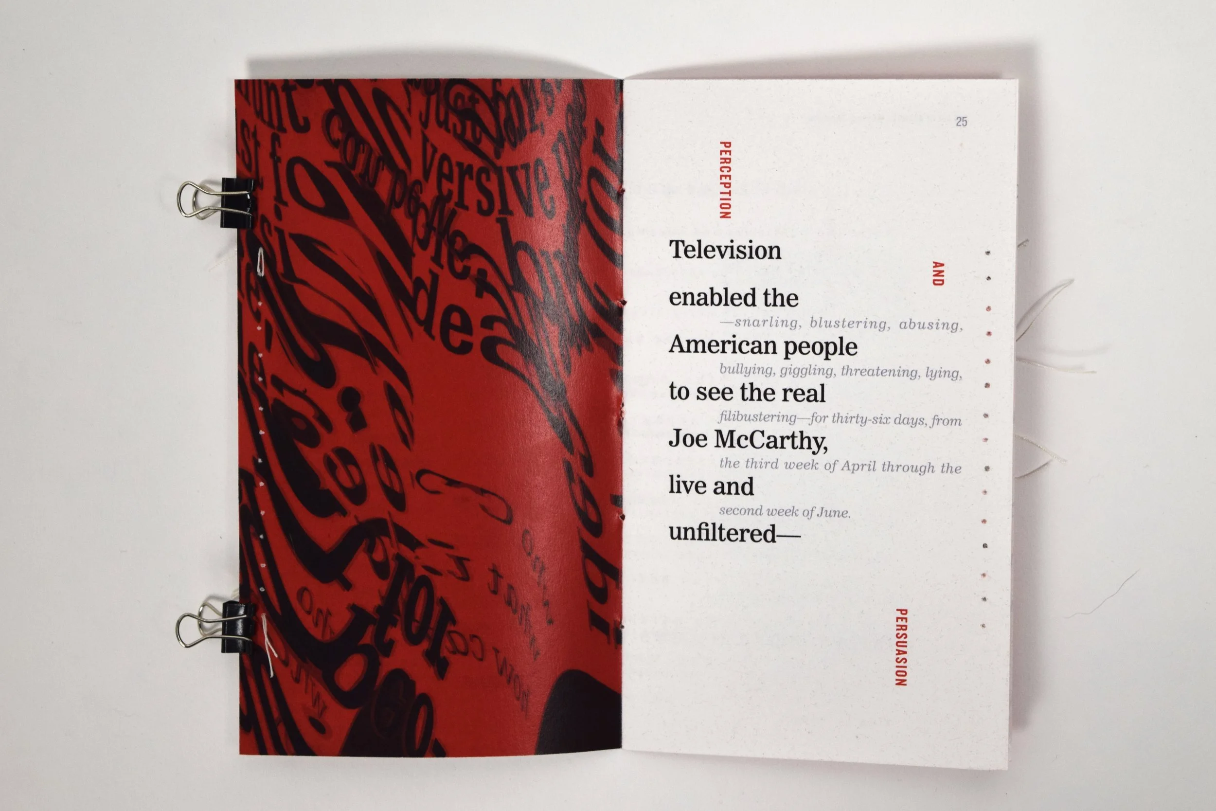
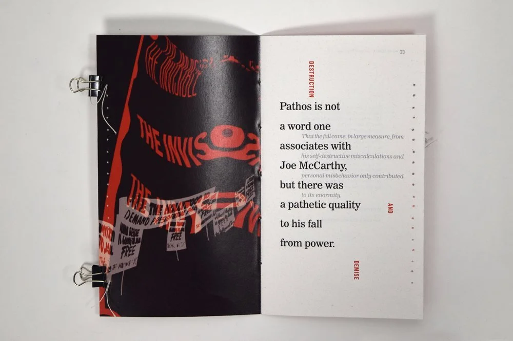
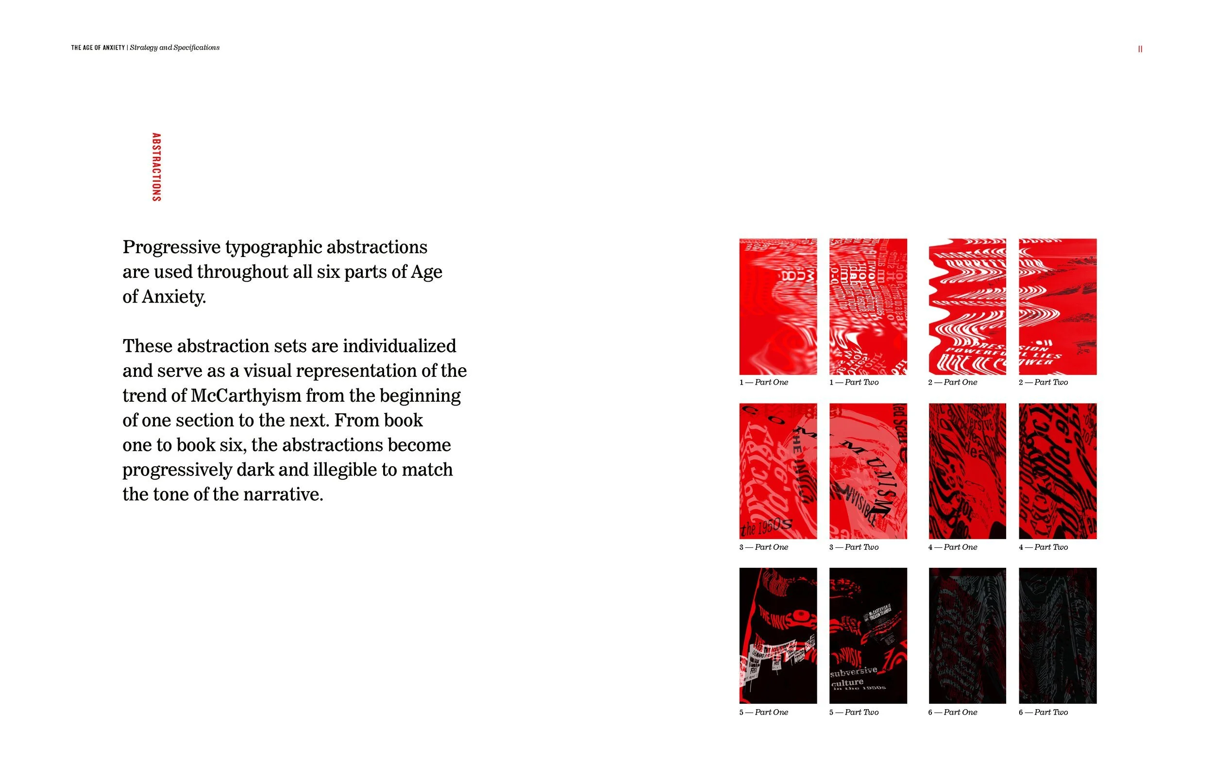
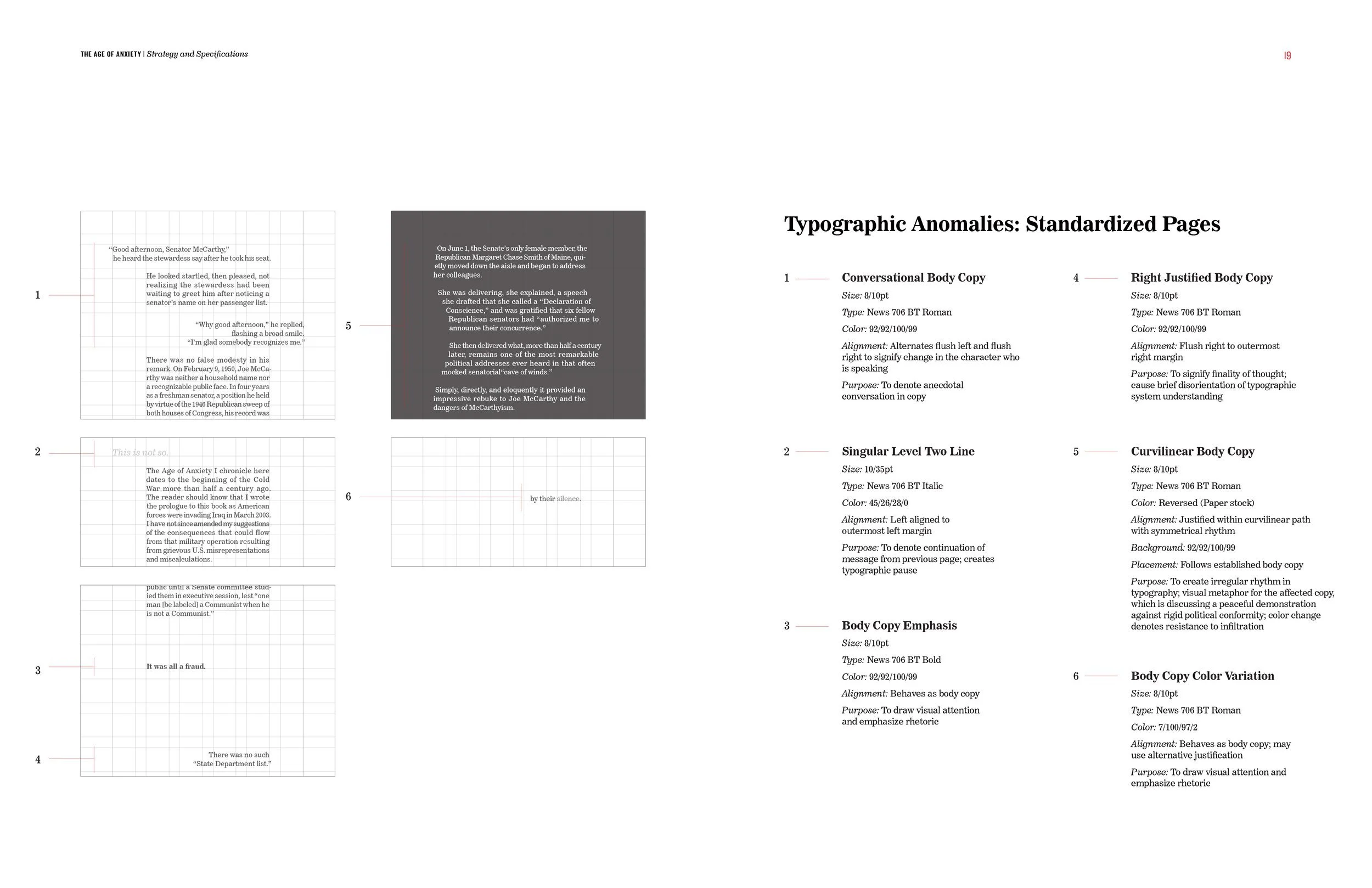
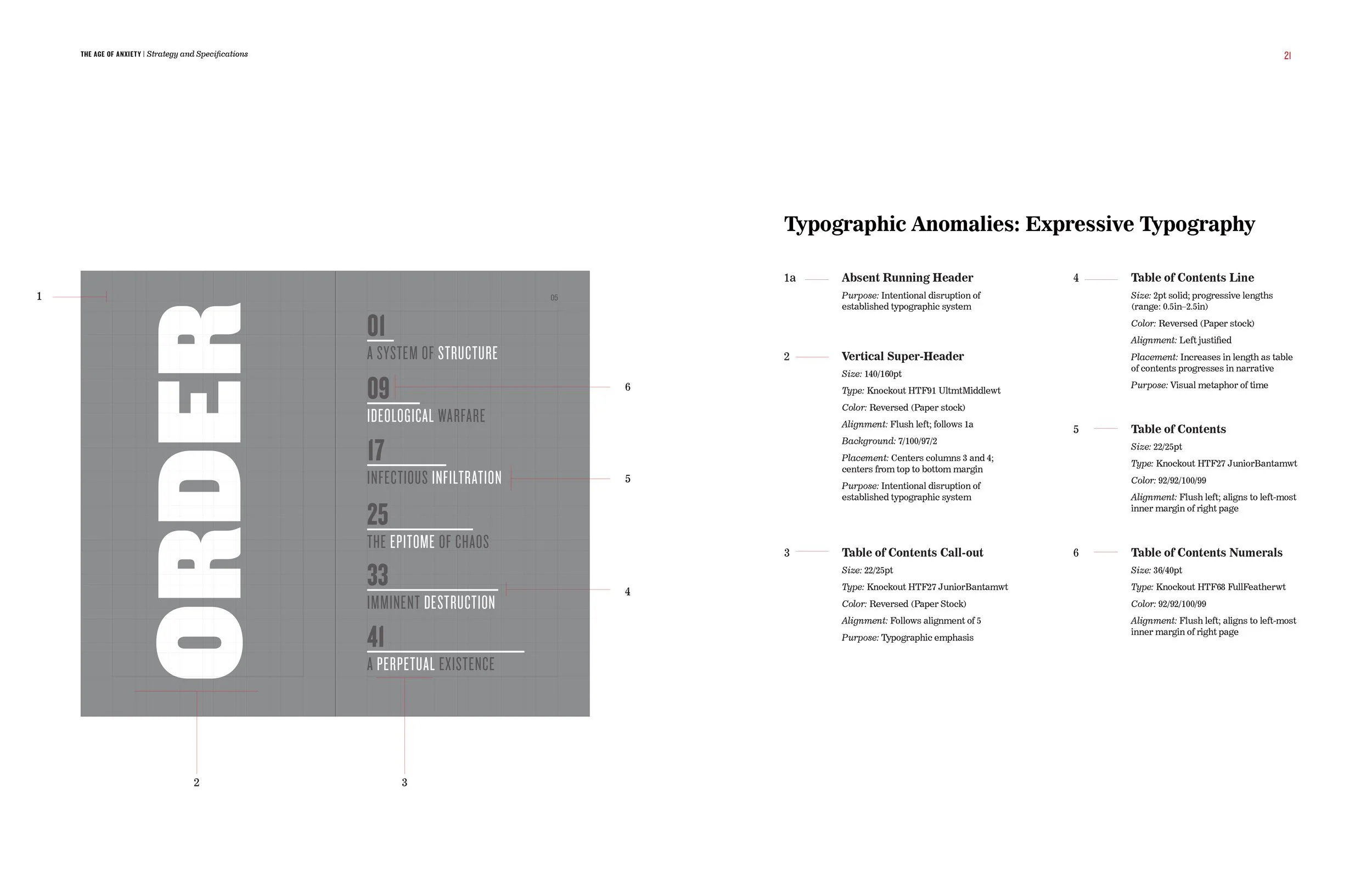
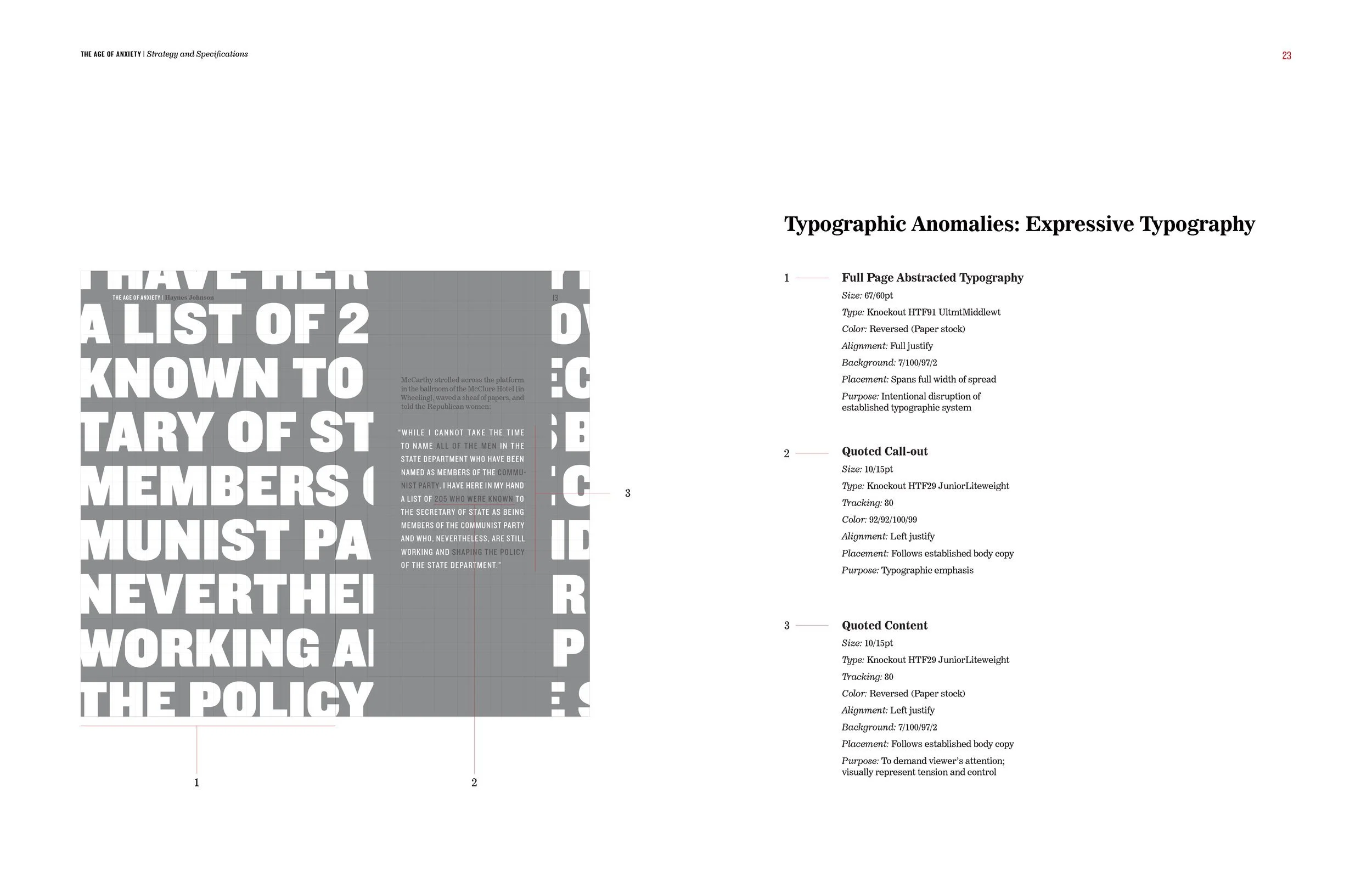
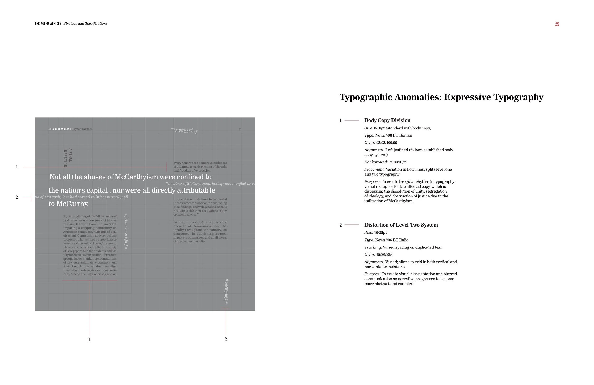
There are six individual signatures which each tell a portion of the McCarthy narrative. From book one to six, there are fluctuations of disorder, structural deterioration, and chaos as the narrative becomes increasingly layered and complex. At times, justice and order is dominant; other times, chaos wins.
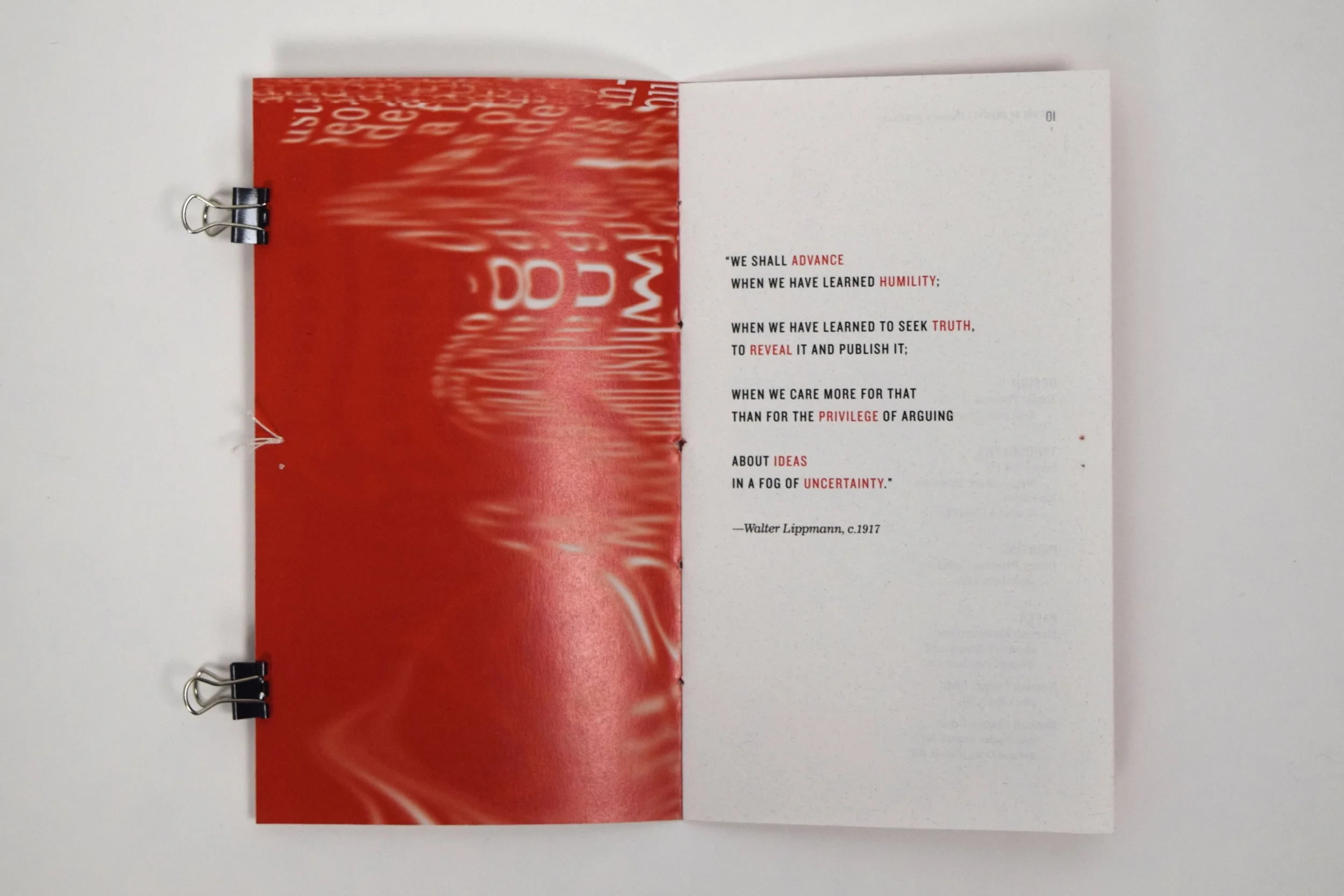
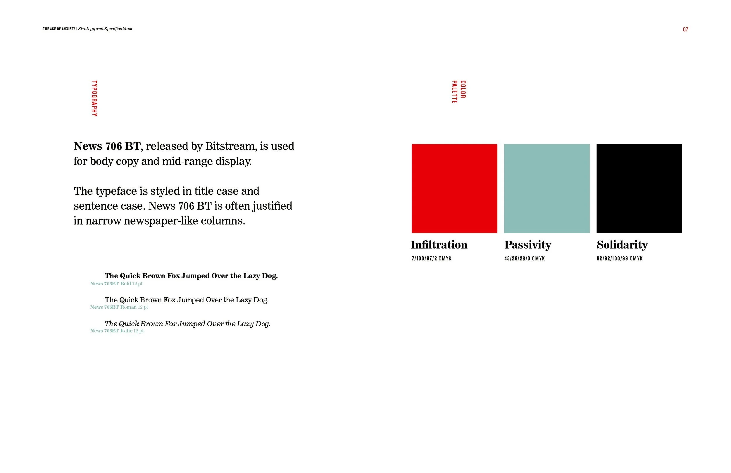
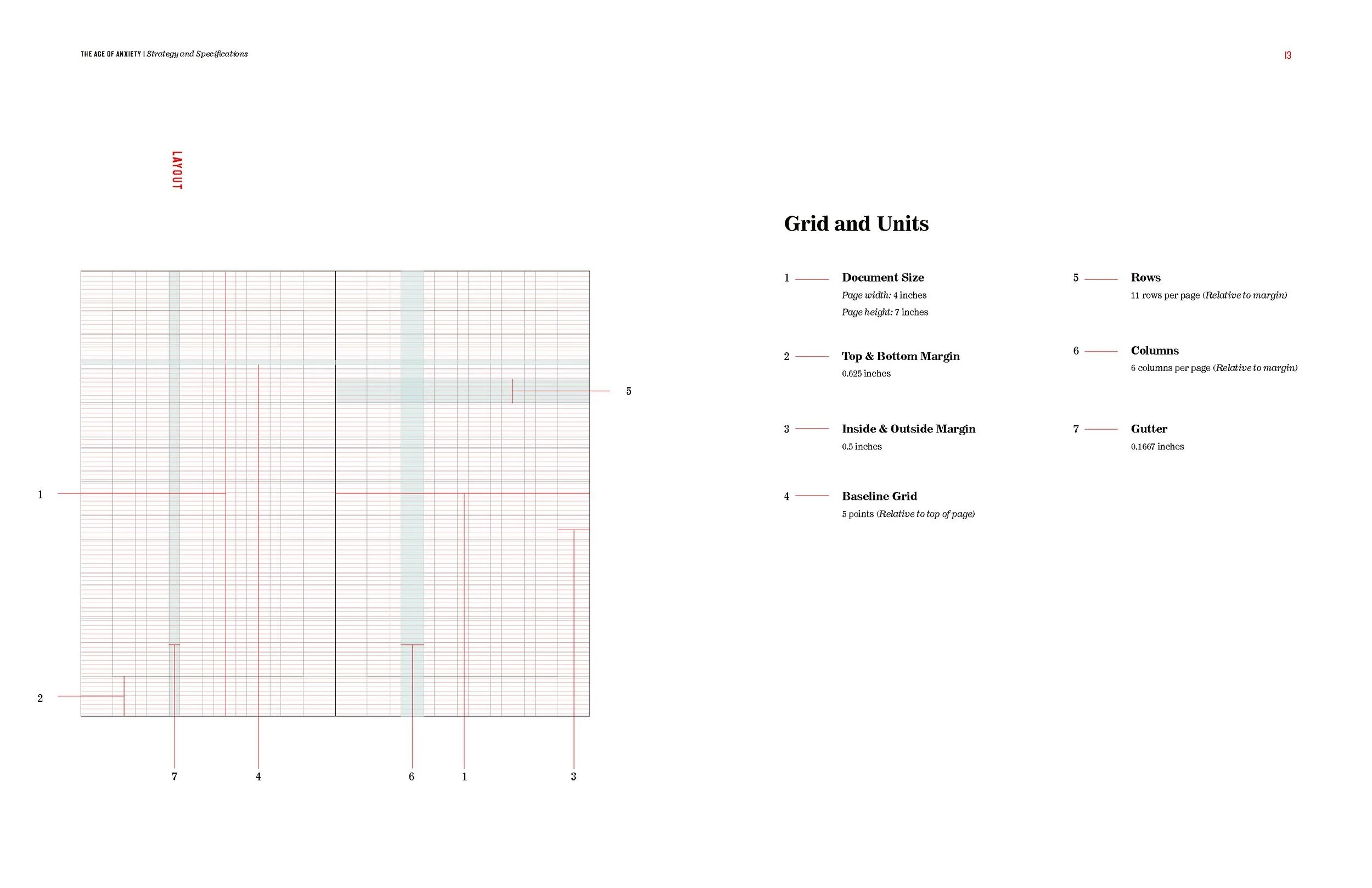
The format of the book is sized to match an American-produced mass-market paperback book, which speaks to 1950s consumerism culture and conformity in standard printing productions. The color palette references the Communist Manifesto, which sparked communist ideologies in the west; red represents infiltration of subversive thought; gray-blue represents passivity; black represents solidarity.
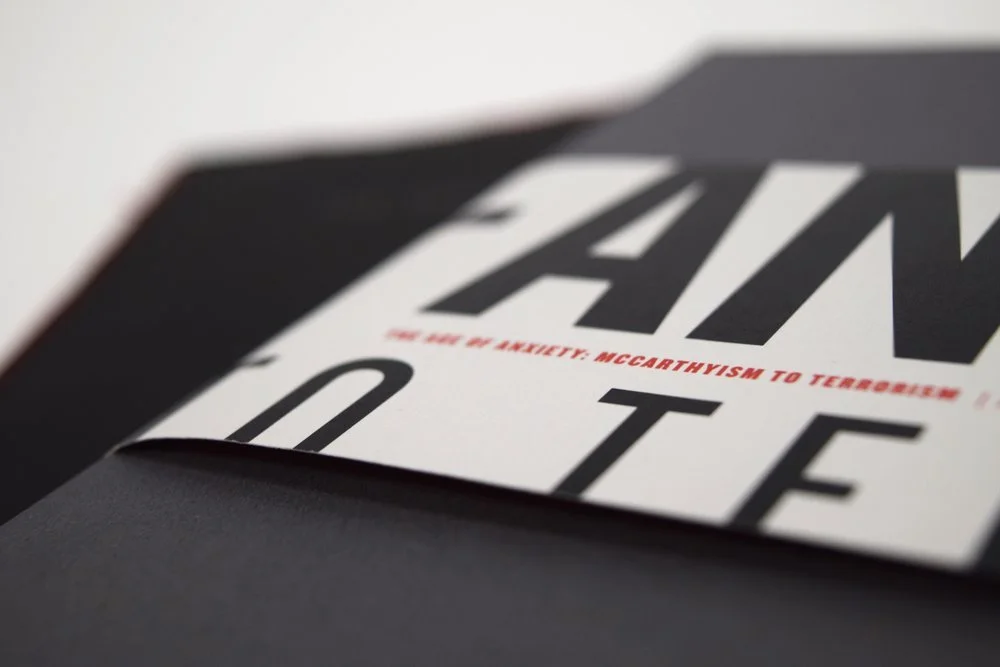
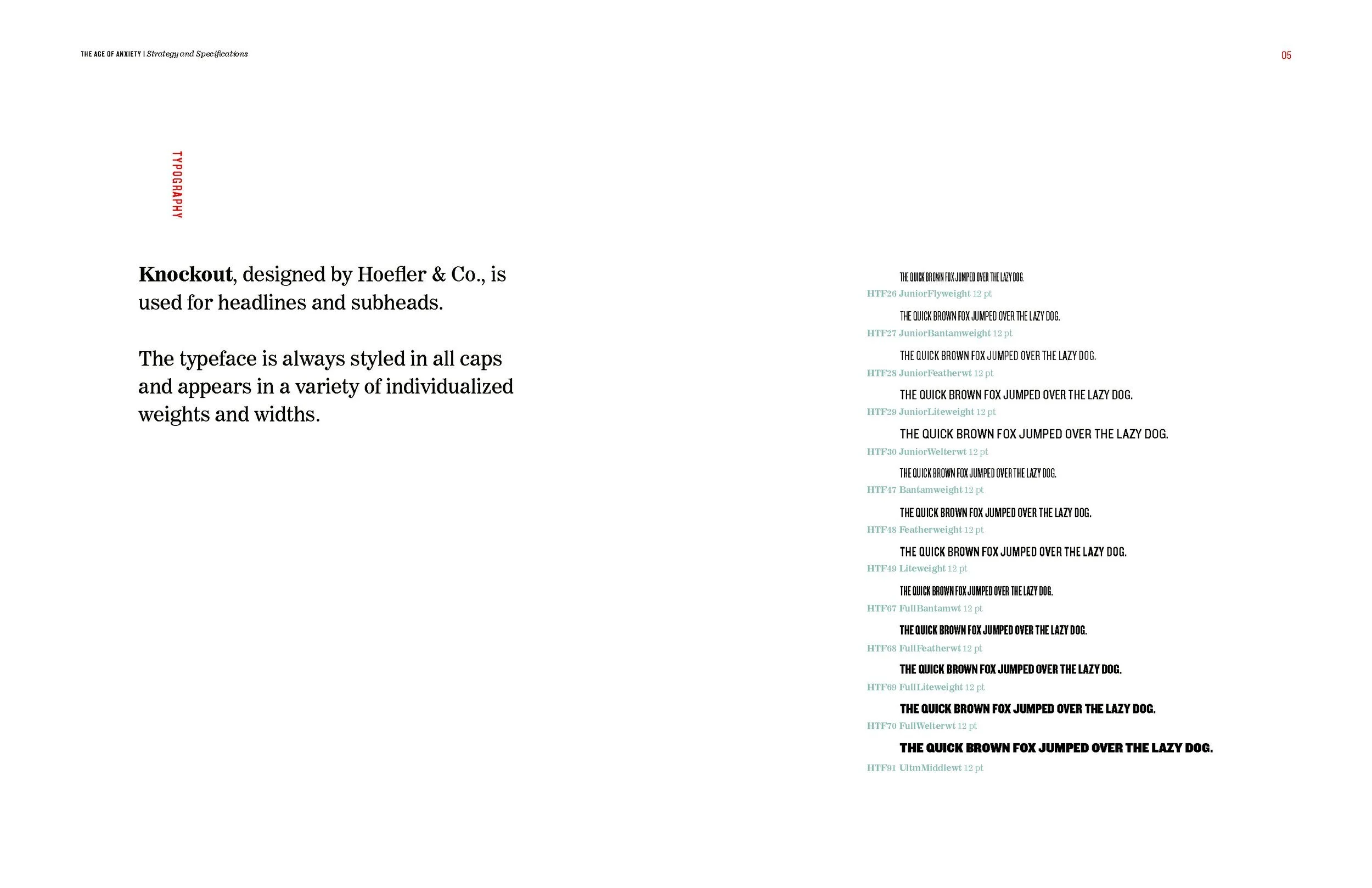
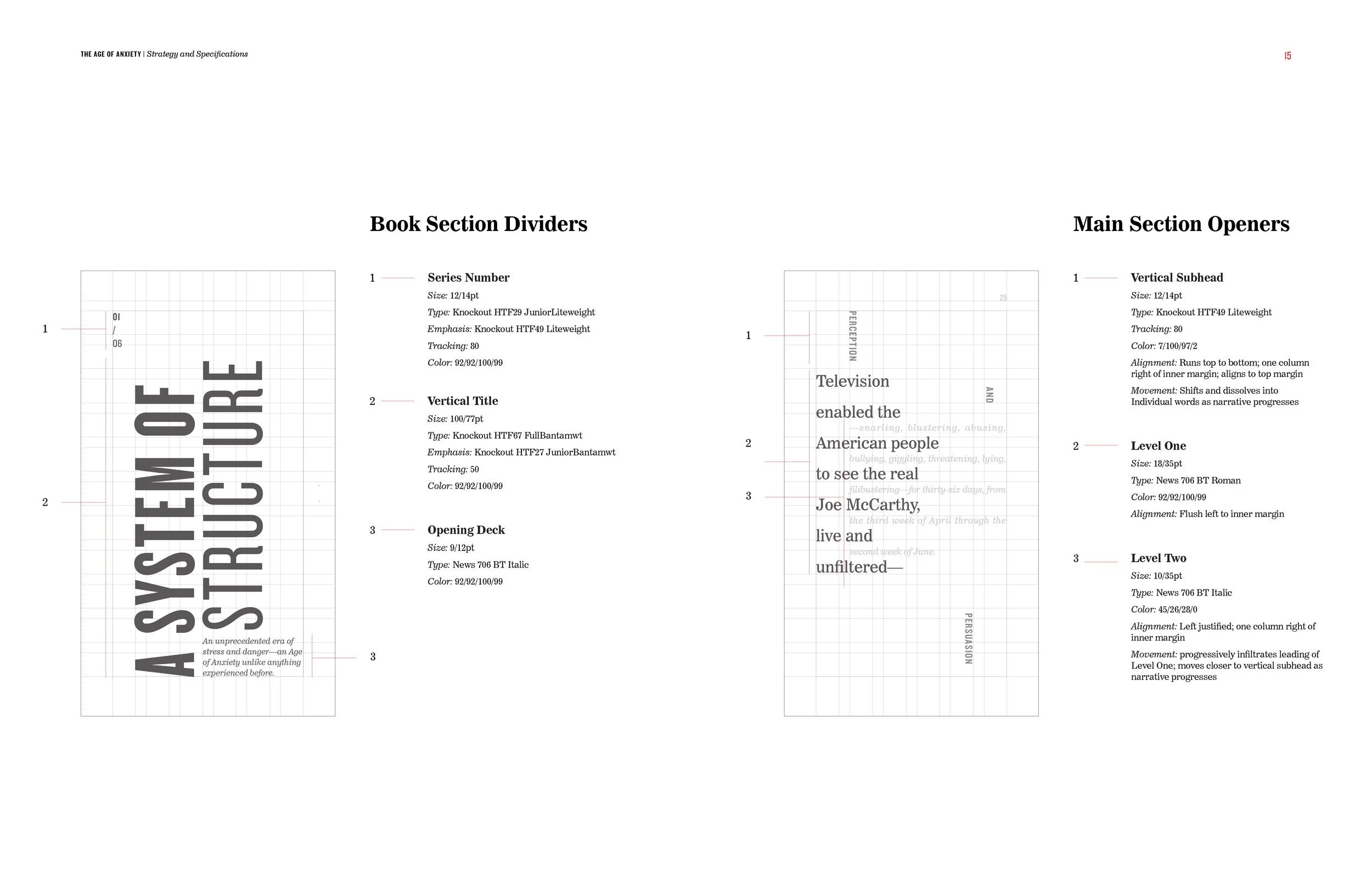
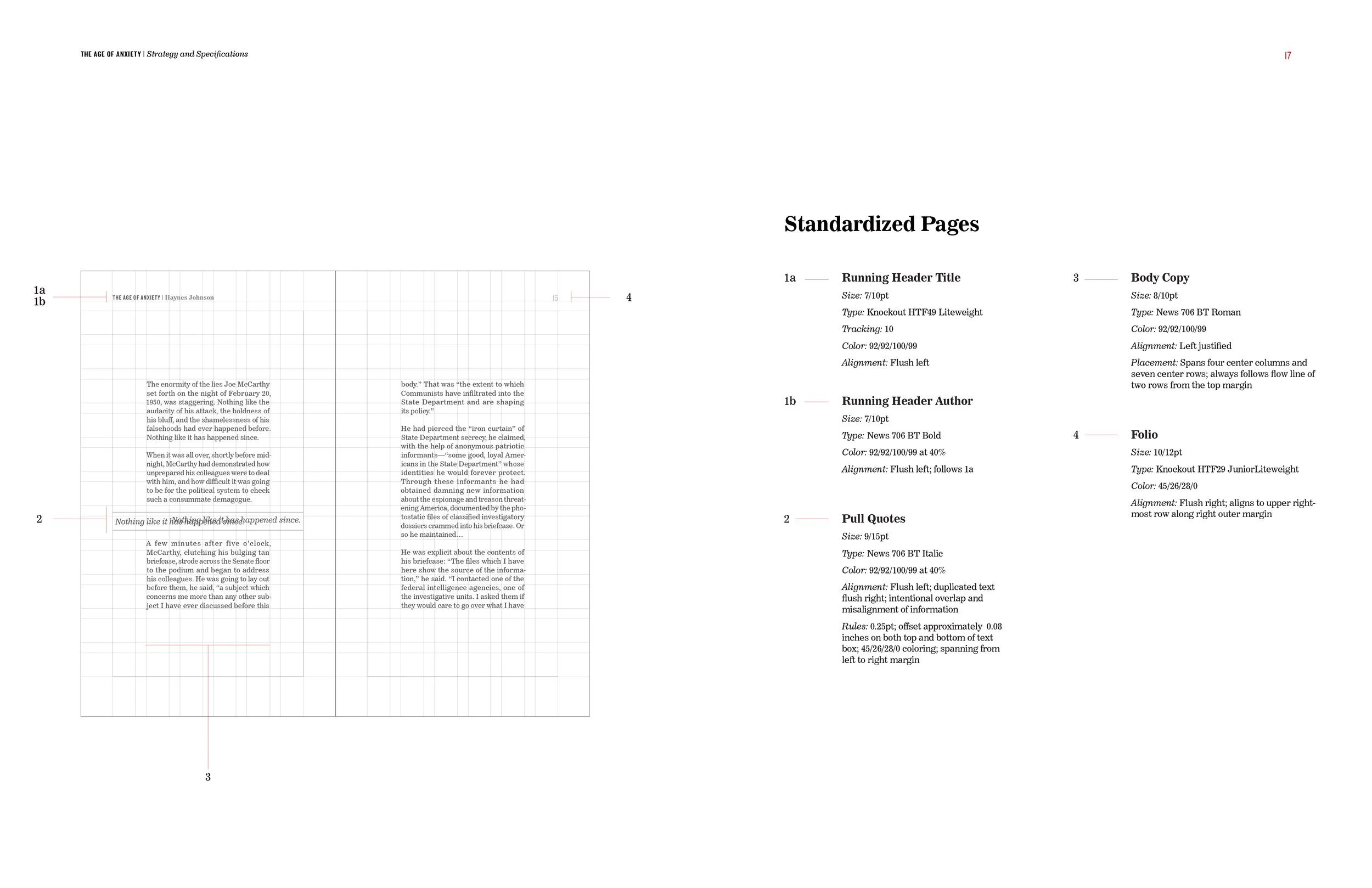
The typography for this project is Knockout and News 706 BT. Both typefaces are American-made — a tribute to the 1950s pro-American nationalism. Knockout is the authoritarian of the typography styling. It’s a sans-serif grotesque family with a full range of graphic, assertive, and individually designed weights and widths. News 706 BT represents humanity. It’s a clarendon serif designed for newspapers with curves, legibility, and soft serifs. The narrow column widths (35–50 characters) replicates 1950s newspaper column widths, as newspapers were a primary form of communication during the McCarthy era.